 As an artist, your sketchbook is central to your creative process. It is not a place for polished, perfect, art-gallery-quality work. Your sketchbook is your creative workspace, where you try out ideas, perfect and refine some of those ideas, and discard others. When working in your sketchbook, remember these three cardinal rules:
- Give up your impulse to control what comes out. This is not a time to be judgmental, analyzing every line and shape. This is a place to let your creative impulse run free, without restraint or control, without exception. Keep your logic center out of the process!
- Take parts of what work, and develop only those. Discard what isn't working, and focus on what is working, and develop that. Draw multiple versions of it. Play with your visual ideas, like a child with Silly Putty. Use different angles, shapes, and points of view. You'll never know how it looks until you throw it onto paper and see for yourself. This is where you do that.
- Sketchbooks are for words as well as drawings. Take notes while you're sketching, playing free association, where one note leads to another, to another. Jot down ideas that come to you while you're sketching before you forget them! This is very important. Good ideas are few and far between. If you have one, jot it down quickly in your sketchbook, so you can fully explore it later, when you have time.
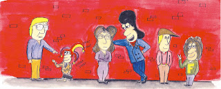 Below are some scans from some of my earlier sketchbooks, when I was developing a comic strip called Conundrum. The strip starred Cuthbert, the lonely sad sack, Dirk Deadmeat, an arrogant chauvinist, Lily, the female character who always brings Dirk down a peg or two, Dirk's sidekick Frag, and Streeter, the intellectual influence. Conundrum was more of an exercise than anything else, and has not been published, but I learned a lot doing it. Click on each one for a larger view.
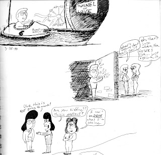
I usually work out my ideas with a pen instead of a pencil, since I don't really care how good the results are; I'm just trying them out. Here I had some visual snapshots I wanted to throw down, to see how they might look, or if I might be able to use them.
Cuthbert in a bumper car heading into an old fashioned Tunnel of Love? Pretty weird, and kind of amusing too.
Cuthbert separated from the pretty ladies by a brick wall...on the fence with that one. Not sure I like it.
Hmm...this idea might have some promise; Dirk trying to teach Cuthbert how to be cool by putting a Dirk Deadmeat wig on him, while Lily rolls her eyes.
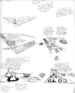
I wanted to do a panel where Cuthbert and Streeter are walking on a huge board game, which represents life, talking about how random and unpredictable life can be. I had a hard time trying to figure out what angle would be the best point of view to draw the action from, as you can see. This would be a complex series of drawings, since I would have to set up multiple perspective guidelines, so everything would look correct.
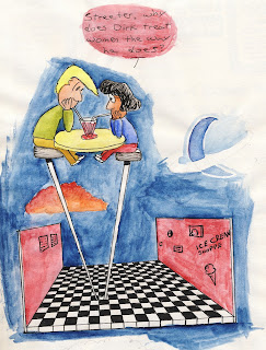
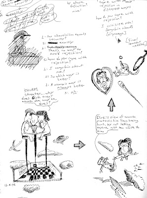 Some random visual ideas I wanted to try out, to see how they might look. On the left are some ideas for a conversation between Lily and Streeter, working out the dialogue. I liked the barstool image, so I did it with watercolor, to see how it might look if it was in the Sunday paper. It depicts an abstract scene where Lily and Streeter are having a deep conversation about why Dirk is the way he is. The point of this strip would be that everyone has a motivation for something, and the most common motivation people have is fear.
Drawing The Kingdom
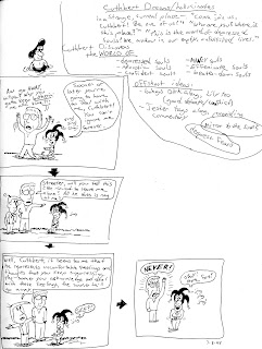 I had the kernel of an idea for an on-going story involving Cuthbert: he finds himself in the Kindgom Of The Depressed Souls while asleep, a development he is less than thrilled with. I jotted down my ideas quickly before I forgot them; see the page on the right. Ideas are kind of like plants; they need to be nurtured and cultivated.
I then started quickly sketching out the panels and dialogue in my sketchbook, having no idea where the story would go. Sometimes that's the best way. Don't freeze up because you haven't planned the ending. Plunge in anyway.
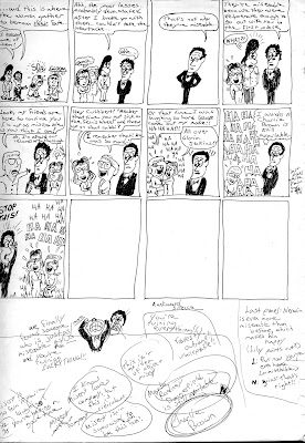
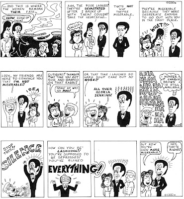
To my surprise, the ideas were coming almost as fast as I could put them on paper. Compare the rough sketchbook strip to the completed strip beneath it to see the difference. Again, when sketching out your ideas, your goal isn't artistic quality, it's to preserve your ideas as quickly as possible.


 Near the end of the storyline, I kind of wrote myself into a corner, where I wasn't sure how I was going to end it. So, I jotted down some random thoughts about what might be the best way to neatly end this storyline (see the notes scribbled at the bottom). Again, compare the sketchbook version with the final version beside it.
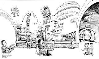
At a Borders bookstore years ago I was sketching the people in the coffee shop. No, that's not the way it actually looked. I grew bored of the drawing and decided to just let my imagination run wild and see what would come out. I'm glad, because I ended up with a much more interesting sketch. The moral of the story? Don't be too realistic with your sketches! This is supposed to be fun.
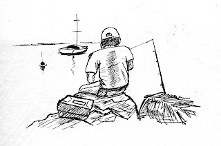 And finally, I leave you with a quick, five minute sketch of a guy fishing on the Hudson River at sunset. Sometimes less is more.
So, to recap, your sketchbook is not your portfolio. It's a place where you are free to try out any idea, no matter what it is. Keep it fun, keep it simple, let your imagination run free, and when you get good ideas, nurture and explore them, and see where those ideas take you.


No comments:
Post a Comment