Nov 16, 2008

Comics Review

It's time again for some more interesting art and cartooning-related links to explore. We'll start off today with a look at some more examples of illustration and comics that are worth noting. Art is not created in a vacuum; it requires exposure to other artists, techniques and concepts. Enjoy these examples and links!

Everybody knows that Dr. Seuss (otherwise known as Theodore Geisel) wrote children's books. Less known is his work in commercial art, creating illustrations for a variety of products. He was also a prolific editorial cartoonist during World War 2, and created many illustrations opposing Adolph Hitler and the dictator Benito Mussolini. You can learn more about Dr. Seuss here. Below are some examples of Geisel's work in commercial art, from the website The Advertising Artwork Of Dr. Seuss. Be sure to check it out!


Geisel did most of his commercial art for an insect spray called Flit, and created a large number of amusing illustrations for this product.


This is one unhappy looking horse. Obviously that apple won't taste right unless it's coated with Holly Sugar!


What's next for the genre of comic strips? Will the decline in newspaper readership be the end of the traditional comic strip format?

An article in the New York Times (The Comics Are Feeling The Pain Of Print, New York Times, 12/26/08 by Leslie Berlin) describes a trend of comic illustrators to make their strips available across a wider range of formats instead of strictly in the newspaper. With fewer people reading actual, paper newspapers, and the Internet being the primary source of information, syndicates that market comic strips, and artists themselves, are trying to find a way to stay relevant.

In the late 1800s and early 1900s, newspapers flourished, and there were several editions a day. You could pick up the morning paper, the afternoon paper, or the evening paper. Men like William Randolph Hearst (the inspiration for the movie Citizen Kane) and Joseph Pulitzer became millionaires running newspaper empires. It was the rivalry between Hearst and Pulitzer that led to the first comic strip with regular characters, The Little Bears, drawn by James Swinnerton (shown above). The strip was designed to do one thing: sell more newspapers. The comic strip was enormously popular and propelled Swinnerton to the top of his career (you can read more about James Swinnerton HERE).


Comic strips in newspapers flourished, with some taking up whole pages. Beautifully rendered strips like Prince Valiant (right), and satirical, whimsical strips like The Katzenjammer Kids (below left) became household staples. It was the golden age of the American comic strip, and the American newspaper.


With newspapers in decline these days, the comic strip page is a shadow of its former self, with some papers devoting only a third of one page to comic strips. New artists have a hard time breaking into the industry, with dwindling numbers of papers supporting artists. Increasingly, more comic strip artists are taking their creations on-line, as well as in print; many strips can be found on-line only. In order to survive, artists are having to make their comic strips available not only in print, but on websites, and mobile devices. An era of American art is beginning to come to an end.

One syndicate, United Features Syndicate, distributor of many strips including Peanuts, Dilbert and others, is choosing to put all their comic strips on-line for free, at comics.com. After initially charging users to view comics, they decided that this was limiting the comic strips' exposure too much. The fee was dropped, and visits to the site soared. Do yourself a favor and visit the site, and acquaint yourself with some of the different styles of the comic strip artists on the site.

What's next for comics, as the newspapers begin to move on-line from the printed page? Only time will tell.


Graphic novels are a relatively new literary phenomenon, and the term is used loosely to describe a type of comic that usually has a beginning, middle and an end, and deals with more diverse and mature themes than the children's or superhero comic books do. One of the advantages of the genre is its diversity; graphic novels can take almost any form, using almost any drawing mediums, and can be about almost anything. Anyone can do a graphic novel, about anything, which is the allure of this format. Graphic novels are simply another way to tell a story, and they can be three pages long, or three hundred. To give you a glimpse of the diversity of this format, I've showcased some examples. Click on each example to get a larger view, to appreciate the technique used to create them.


"Percy Gloom" by Cathy Malkasian

This graphic novel is done entirely in two shades of colored pencil, giving it a dreamy, fantasy-world like appearance. It is about a shy, insecure little man named Percy Gloom who runs into a series of very odd people during his attempts to get a job at a company that writes warning labels. The plot , which drifts almost aimlessly, is secondary to the artwork however. One needn't have a huge arsenal of pens, brushes, inks and paints to create a graphic novel; in Ms. Malkasian's case, she only needed paper and two colored pencils.


"Carnet De Voyage" by Craig Thompson


Less a graphic novel than an illustrated travel diary, Thompson created this when traveling through France, Barcelona and Switzerland while researching his next graphic novel, Habibi. It is an entertaining read, filled with sketches of people Thompson had met and places he visited, along with diary entries. It is interesting to read his descriptions of the people he meets, along with the loneliness and frustration he sometimes feels. The lesson from this example is don't think you have to go into a project knowing exactly what is going to happen. Make it up as you go along!


Storyboards, as you may already know, are very rough sketches that are done in the pre-production phase of a movie, to plan exactly how a particular sequence or scene in a movie will be shot. That way, no time is wasted when the cameras are ready to roll; everybody knows exactly what will happen ahead of time, saving time and money. Some filmmakers storyboard the entire movie when they are working with a small budget, in order to be as efficient as possible.


Storyboard sketches are rough and quick, not intended to be artistic; they are intended only to convey important information when planning a movie's filming schedule. However, they are an art form in their own right, and offer glimpses of early ideas being considered before filming begins.


This Flickr set of early Star Wars storyboard sketches are fascinating; a "pirate ship" which would later be the Millinium Falcon (and looks nothing like the Falcon that we know today), and early sketches of Darth Vader in his TIE fighter.


S
toryboards have a long history, originating from the Disney studios in the 1930s. You can read more about storyboards here.


Sep 8, 2008

Keeping It In Perspective

This post is going to teach you the basics of drawing perspective. Perspective is a technique that makes your buildings and drawings look real, since they converge on an invisible vanishing point, the way things do in real life. If the perspective of a drawing is incorrect, it is noticeable right away, and robs your drawing of its credibility. You don't want that.


The Vanishing Point

Everything you see has a vanishing point, a point where everything comes together. At the vanishing point is the horizon line, the horizon of the earth from your point of view. This is the way things look to your eyes, from where you're standing. Normally you can't see this point, because there is too much stuff in the way: buildings, trees, cars, etc. But if you stand on a set of railroad tracks, you can see the vanishing point perfectly.

The tracks just seem to "merge" together. The tracks don't really meet, of course; it just looks that way, from your perspective.

The horizon line and the vanishing point are the first things you need to establish when setting up your drawing. Everything will converge on the vanishing point, because if it doesn't, it just won't look right. You can see examples of vanishing points and perspective everywhere you look, as in the following examples.


On these street photos you can see perspective in real life, along with the vanishing point. In the picture on the right, you can't see the vanishing point, because it's hidden by the building at the end of the street.


Wrong Perspective


When the perspective is wrong on a drawing, you immeadiately notice it. You may not know exactly why the picture looks wrong, but your brain isn't fooled. It can tell. Look at the comic book panel below, and see if you can figure out why the drawing looks wrong. Scroll down for the answer.


Need a clue? Check out this close-up...

Now look at these perspective guidelines. See the mistakes in perspective?This drawing is a mess. The castle doesn't line up with the vanishing point at all, giving it an odd, weirdly-angled look. All the angles on the front side of the castle should meet at the same vanishing point, or else it will look wrong, like this one.


How To Draw Proper Perspective

Now that you know what proper perspective is supposed to look like, let's create a perspective drawing, step-by step. Don't worry; it's not as hard as it looks. Ready? Here we go!

STEP ONE: Horizon and Vanishing Point


LIGHTLY
draw the horizon line with a ruler on your paper. Do not press down hard, because you will need to erase a lot of this line later. Your pencil should be barely touching the paper. This is your horizon line, as if you were standing on a flat, featureless desert plain. Somewhere on that line, pick a spot; that will be your vanishing point (or VP, from now on).


STEP TWO: Create Your Guidelines


Line your ruler up with the VP, choose an angle, and draw some guidelines, LIGHTLY. It will look like a road on the desert. These guidelines will help keep everything correct as you construct your drawing. Everything must converge on the VP or your drawing will not look right.


Draw another set of guidelines, going up from the VP. Again, line your ruler up with the VP, choose your angle, and draw some light lines. This will be the tops of your buildings. You can obviously draw several guidelines for buildings of different heights, but for now, let's keep it simple. Notice you can still see the horizon line. You won't be able to in a few steps, as you'll see.

Onto the next step!!


STEP THREE:
Draw the Edges Of Your Buildings


Now it's time to draw the near and far edges of your buildings. Where you put them is up to you, but they will always be perpendicular, or at a right angle, to the HL (horizon line). If your building edges are at an angle, your building will look odd, as if it was built with a slanted face. Some buildings are, obviously, but for the sake of this exercise, let's keep it simple, shall we?

Erase the HL behind your new building face. We don't need to see it anymore, because it's hidden now. This is why I urged you to keep your lines very light.


Now let's draw the sides of the buildings that face us, from our point of view, from where were are standing. There is no perspective here, because we're looking head-on at the sides of these buildings. They do not recede toward the vanishing point. So, these lines should be parallel to the HL, perfectly horizontal. They should not be angled at all, otherwise they will look strange. I have colored the face of the building just for the sake of clarity; you may want to lightly shade your buildings, just to keep them straight in your mind while you're working.

Now, let's take it up a notch, and draw some more buildings, whaddya say? You've come this far, right?


Draw some more guidelines, again, lightly. Line your ruler up with the VP, choose another angle, and draw a line. Do the same thing for the other side of the street. Erase the excess lines you don't need to see (like the ones leading to the VP; you don't need those anymore).

Then draw the straight up-and-down edges of the buildings, then, lastly, the roofs, which will be horizontal. See? You're starting to get the hang of it now. Wasn't as bad as you thought it would be, huh?

The only problem is our buildings have no windows or doors. They look like huge cement blocks. Well, let's make fixing that our next step!


STEP FOUR: Drawing Windows and Doors


Yes, more guidelines. Hey, you need 'em when your doing perspective drawings. OK, ruler on the VP, and draw some narrow guidelines this time. You may want to lightly shade between your guidelines, just to make it easier for yourself. You can draw as many rows of windows as you want. Do the same thing for the other side of the street.


The edges of your windows should be straight up-and-down. This is important. Check to make sure the lines are straight by comparing your ruler to the edge of your paper. If the ruler is not at the same angle as the edge of your paper, it won't look right. Make sure your windows get thinner the farther away they are, the way the do in real life.

Use the same technique for the doors as well.

And that is perspective in a nutshell! Make sure your lines join at the VP, and you'll be fine. Hope you enjoyed this lesson. As you practice with perspective, you'll see how changing the angles of your guidelines give you very different results. Most important of all, your drawings will look accurate.


Aug 24, 2008

Alice In Wonderland Remixed

or the first video to be shared on the Magnum Arts blog, enjoy this addictive, ultra-cool remix of Disney's Alice In Wonderland. This video is so mesmerizing, I could watch it all day! If you like the music enough (and I did), you can download it from the YouTube source through the following link. Copy and paste the link into your browser, then click on the "more info" link on the right side of the YouTube window, and it will give you the mp3 link.
http://www.youtube.com/watch?v=pAwR6w2TgxY


Directly beneath is another video, scenes from a video game called American McGee's Alice, which took Wonderland in a whole new, darker direction. The premise has Alice lying catatonic in an insane asylum, unresponsive to any outside stimuli. In order to regain her sanity, she must venture back, in her mind, to Wonderland, but she finds it a very different place. Dark, threatening, dangerous, she has to battle the Queen's card guards and a variety of monsters to free Wonderland from the evil that consumes it. This Alice is a far cry from the Disney version; she carries a knife and her apron is bloodstained. Her eyes have a vacant, haunted look. The game is a brilliant example of storytelling, mythology and graphics which still hold up. If you want to see the darker side of Wonderland, check it out. Sometimes traditional stories can be "refreshed" by telling them in a new way.


Note to Internet Explorer Users: I've noticed a big empty box that appears above the two videos; I'm not sure why. On Mozilla Firefox it appears perfectly. If you're using Microsoft's Internet Explorer, take my advice and use Firefox instead. It is a much, much, better Internet browser. It's free, open source and has much more useful features. Visit this link to learn more about Firefox.


Aug 17, 2008

Clone Wars Movie Premiere

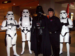
The 501st Legion invaded the Pinellas Park Regal 16 for the opening of the Star Wars Clone Wars movie, and the event was a huge success. The best part was the expressions of the kids' faces who came face-to-face with their favorite Star Wars characters; there were a couple of kids in wheelchairs who got a chance to hear Darth Vader breathing. You can't put a price on something like that. That's what makes this organization so special: the joy that it can bring to others. Special thanks to some of the 501st members for letting me post some of their pictures.


One member has a fully functional, life-size R2-D2 'droid he built by himself in his living room. It makes all the noises and movements! I want one of my own in the worst way!!


There's something you don't see every day...jawas playing video games!


Aug 12, 2008

Your Sketchbook - Your Inspiration

As an artist, your sketchbook is central to your creative process. It is not a place for polished, perfect, art-gallery-quality work. Your sketchbook is your creative workspace, where you try out ideas, perfect and refine some of those ideas, and discard others. When working in your sketchbook, remember these three cardinal rules:


  1. Give up your impulse to control what comes out. This is not a time to be judgmental, analyzing every line and shape. This is a place to let your creative impulse run free, without restraint or control, without exception. Keep your logic center out of the process!
  2. Take parts of what work, and develop only those. Discard what isn't working, and focus on what is working, and develop that. Draw multiple versions of it. Play with your visual ideas, like a child with Silly Putty. Use different angles, shapes, and points of view. You'll never know how it looks until you throw it onto paper and see for yourself. This is where you do that.
  3. Sketchbooks are for words as well as drawings. Take notes while you're sketching, playing free association, where one note leads to another, to another. Jot down ideas that come to you while you're sketching before you forget them! This is very important. Good ideas are few and far between. If you have one, jot it down quickly in your sketchbook, so you can fully explore it later, when you have time.


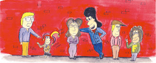
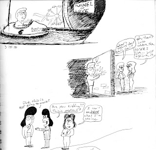
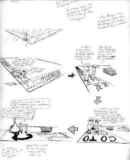
Below are some scans from some of my earlier sketchbooks, when I was developing a comic strip called Conundrum. The strip starred Cuthbert, the lonely sad sack, Dirk Deadmeat, an arrogant chauvinist, Lily, the female character who always brings Dirk down a peg or two, Dirk's sidekick Frag, and Streeter, the intellectual influence. Conundrum was more of an exercise than anything else, and has not been published, but I learned a lot doing it. Click on each one for a larger view.


I usually work out my ideas with a pen instead of a pencil, since I don't really care how good the results are; I'm just trying them out. Here I had some visual snapshots I wanted to throw down, to see how they might look, or if I might be able to use them.

Cuthbert in a bumper car heading into an old fashioned Tunnel of Love? Pretty weird, and kind of amusing too.

Cuthbert separated from the pretty ladies by a brick wall...on the fence with that one. Not sure I like it.

Hmm...this idea might have some promise; Dirk trying to teach Cuthbert how to be cool by putting a Dirk Deadmeat wig on him, while Lily rolls her eyes.


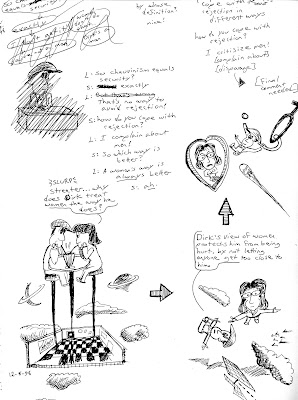
I wanted to do a panel where Cuthbert and Streeter are walking on a huge board game, which represents life, talking about how random and unpredictable life can be. I had a hard time trying to figure out what angle would be the best point of view to draw the action from, as you can see. This would be a complex series of drawings, since I would have to set up multiple perspective guidelines, so everything would look correct.


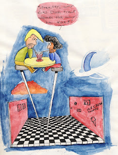
Some random visual ideas I wanted to try out, to see how they might look. On the left are some ideas for a conversation between Lily and Streeter, working out the dialogue. I liked the barstool image, so I did it with watercolor, to see how it might look if it was in the Sunday paper. It depicts an abstract scene where Lily and Streeter are having a deep conversation about why Dirk is the way he is. The point of this strip would be that everyone has a motivation for something, and the most common motivation people have is fear.


Drawing The Kingdom

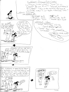
I had the kernel of an idea for an on-going story involving Cuthbert: he finds himself in the Kindgom Of The Depressed Souls while asleep, a development he is less than thrilled with. I jotted down my ideas quickly before I forgot them; see the page on the right. Ideas are kind of like plants; they need to be nurtured and cultivated.


I then started quickly sketching out the panels and dialogue in my sketchbook, having no idea where the story would go. Sometimes that's the best way. Don't freeze up because you haven't planned the ending. Plunge in anyway.

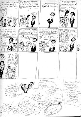
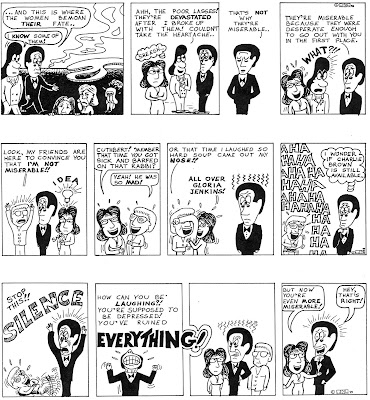
To my surprise, the ideas were coming almost as fast as I could put them on paper. Compare the rough sketchbook strip to the completed strip beneath it to see the difference. Again, when sketching out your ideas, your goal isn't artistic quality, it's to preserve your ideas as quickly as possible.


Near the end of the storyline, I kind of wrote myself into a corner, where I wasn't sure how I was going to end it. So, I jotted down some random thoughts about what might be the best way to neatly end this storyline (see the notes scribbled at the bottom). Again, compare the sketchbook version with the final version beside it.


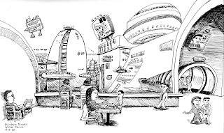
At a Borders bookstore years ago I was sketching the people in the coffee shop. No, that's not the way it actually looked. I grew bored of the drawing and decided to just let my imagination run wild and see what would come out. I'm glad, because I ended up with a much more interesting sketch. The moral of the story? Don't be too realistic with your sketches! This is supposed to be fun.


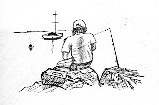
And finally, I leave you with a quick, five minute sketch of a guy fishing on the Hudson River at sunset. Sometimes less is more.

So, to recap, your sketchbook is not your portfolio. It's a place where you are free to try out any idea, no matter what it is. Keep it fun, keep it simple, let your imagination run free, and when you get good ideas, nurture and explore them, and see where those ideas take you.